The Monday after the Tour de France ends is always a day on which I have a little trouble powering down. And I'm just a sports physicist who models the race, not one of the guys in the saddle! I have a lot of fun modeling the Tour de France each year. Most of the fun has to do with learning something new. Using science to understand how athletes perform at the pinnacle of their métiers is what drives my research. Posting predictions of stage-winning times is just fun on the side. The table below summarizes how predictions fared this year.
Nothing like that great start in Denmark! Thirteen of the stages (~62%) were predicted to 3% error or better, which I strive for. Three more stages (~14%) were just outside that error range. And five stage predictions (~24%) were simply terrible. Stages 5, 6 (especially!), and 19 had cyclist power outputs the likes of which I didn't think they could do. But then Stages 12 and 21 were so much slower than anticipated, though I worry less about missing the ceremonial final stage. There is always more to learn!
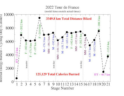
I love estimating cyclist power output. So many riders and teams want to hold that information close to their respective vests. But it's easy to obtain what my model cyclist outputs. Check out the graph below.
The energies in the above graph are supposed to go after the winning cyclist for each stage, not any one particular cyclist. Stage 6 is quite the anomaly! I have a lot of work to do to understand how cyclists could complete the longest stage in the Tour de France at an average speed that was nearly that of a time trial. If they really could achieve those speeds within the confines of what they are supposed to ingest, they definitely needed many Calories that day! To see more of what I have to say on the subject of cyclist energy output during the Tour de France, click here (or here for the article translated into French) for a piece I wrote for The Conversation and here for a neat video put together by Mark Langtry.
Now look at what Jonas Vingegaard was able to achieve while winning his first Tour de France general classification.
That is quite an average speed for Vingegaard! I usually do better matching the stage-winning times than the winner's time. My model cyclist's mass changes, depending on what type of stage I'm modeling. I don't model a single cyclist; I want the stage-winning times. My model wasn't supposed to be that close to Vingegaard's time! What I've learned is that the peloton -- collectively, with all its drafting and shielding of cyclists from wind -- is generating a LOT of power. Tadej Pogačar averaged 41.17 kph last year (3414.4 km total race length) and 39.89 kph the year before last (3484.2 km total race length). This year's race was shorter than those two races at 3349.8 km, and that may partially explain why Vingegaard biked 2.3% - 5.6% faster than Pogačar did during the past two Tours de France. Whatever the case, more analyses need to be performed!
It was another fun summer with the Tour de France. I thank my University of Lynchburg research student, Michael Charecky, for helping me with terrain data acquisition. I'm sure we'll need to tweak the model before next year's Tour de France arrives!


